› added 1 year ago
157
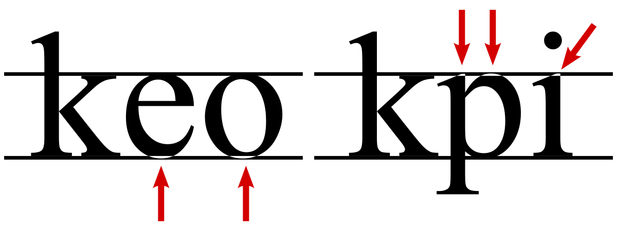
TIL that in many typefaces rounded or pointed (like O or A) are slightly taller than flat letters (like X or H) to compensate for an optical illusion

› added 1 year ago
157
TIL that in many typefaces rounded or pointed (like O or A) are slightly taller than flat letters (like X or H) to compensate for an optical illusion