› added 5 years ago
391

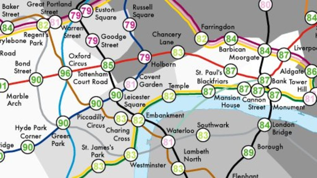
TIL that University College in London created a tube map showing the average life expectancy of those born near each train station. Some born just 1 stop apart had differences of over a decade.
› added 5 years ago
391

TIL that University College in London created a tube map showing the average life expectancy of those born near each train station. Some born just 1 stop apart had differences of over a decade.